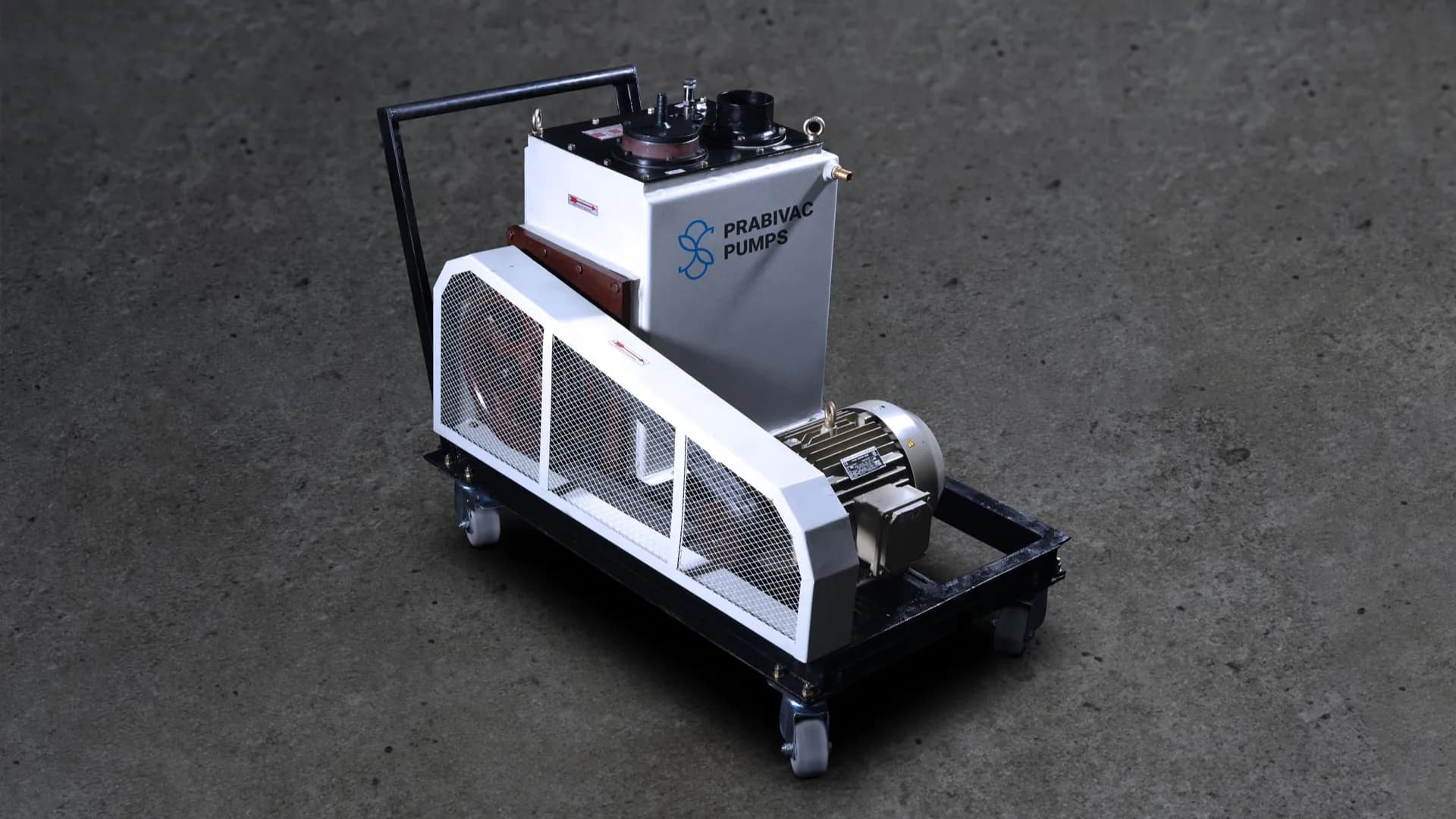
Prabivac Pumps
Branding
Identity
Photography
Website
Prabivac Pumps, founded in 1996 in Chennai, is a well-known manufacturer of vacuum pumps that meet the different needs of industrial and scientific institutions. Their product line comprises of a variety of vacuum pumps that are renowned for their efficiency and great performance. Prabivac Pumps are committed to quality and customer satisfaction which makes them a trusted and reputable brand in the industry.
Prabivac Pumps approached us to refresh their visual identity and brand language, as they aimed to revolutionize their overall brand image. We worked closely with Prabivac Pumps to understand their vision and values, and crafted a new visual identity that captured their essence while resonating with their target audience. The result was a cohesive and impactful brand identity that reflected Prabivac Pumps's evolution and positioned them for future growth.
Approach
The visual identity of Prabivac Pumps is
centered around one thing, their pumps.
Design Inspired by Engineering
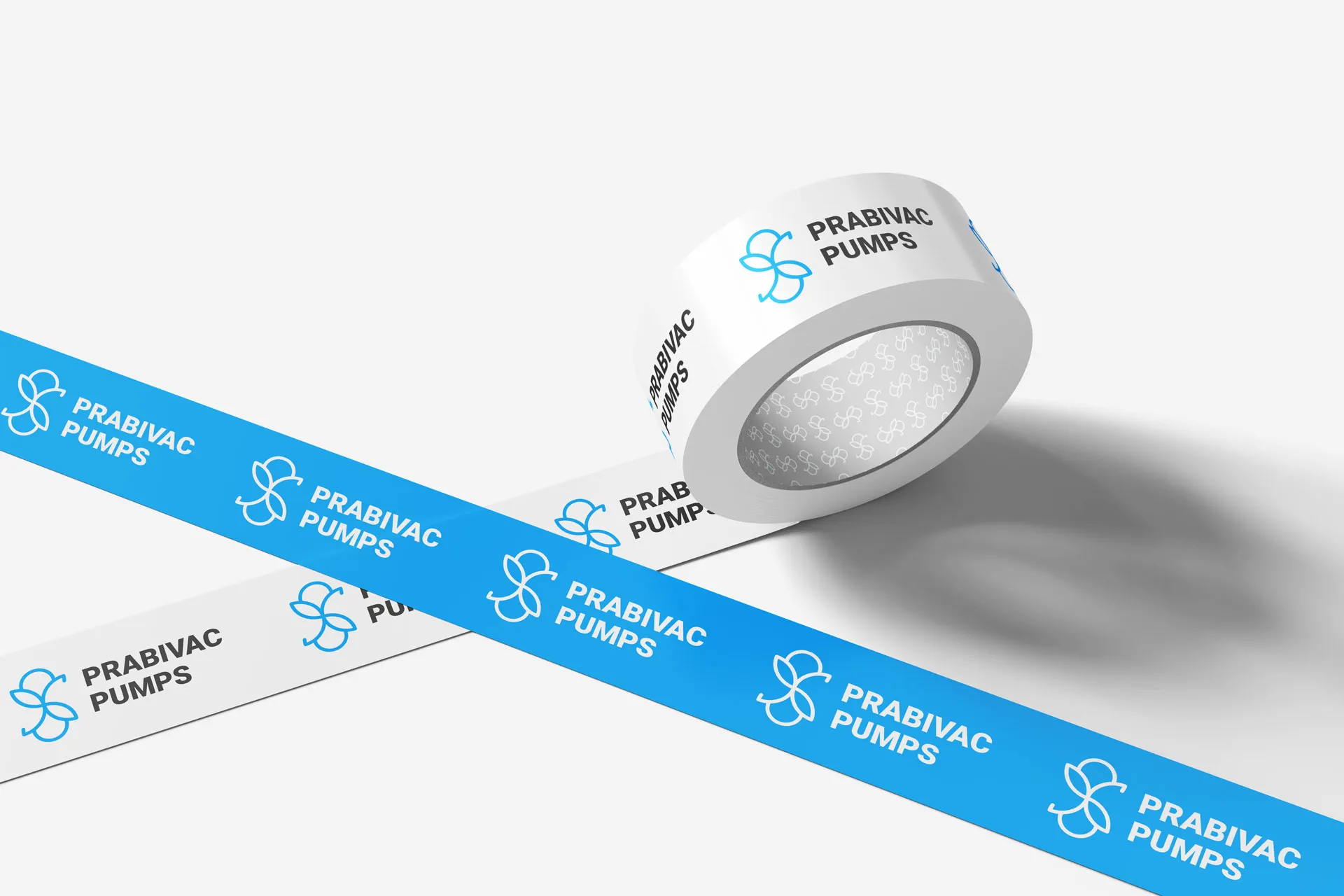
The logo symbol is derived from the fundamental working principle of a vacuum pump — the rotational mechanism that creates pressure differentials to move gases.
The abstract form represents the cyclical motion and internal chamber structure found within vacuum pump systems. By simplifying this mechanical concept into a geometric symbol, the mark communicates both movement and engineering precision.
The result is a symbol that visually reflects the brand's technical foundation while remaining clean and memorable.

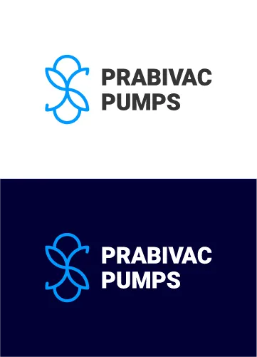
The geometry creates a balanced structure that feels both technical and fluid, reinforcing the idea of controlled mechanical movement.
- Symmetrical engineering-inspired structure
- Continuous flow representing motion
- Simplified geometry for scalability
TYPOGRAPHY
The typography complements the symbol with a bold, highly legible sans-serif style, Roboto.
The clean, geometric letterforms communicate precision, reliability, and industrial strength, aligning with the brand's engineering-focused identity.
The uppercase styling adds presence and authority, making the brand name highly visible in industrial environments.
COLOUR SYSTEM
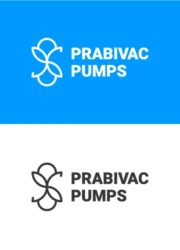
The brand uses a deep blue background paired with a bright blue accent.
Deep Blue represents reliability, engineering excellence, and industrial trust.
Bright Blue introduces a sense of energy and motion, reinforcing the dynamic nature of vacuum pump systems.
This contrast ensures strong visibility across both digital and physical applications.

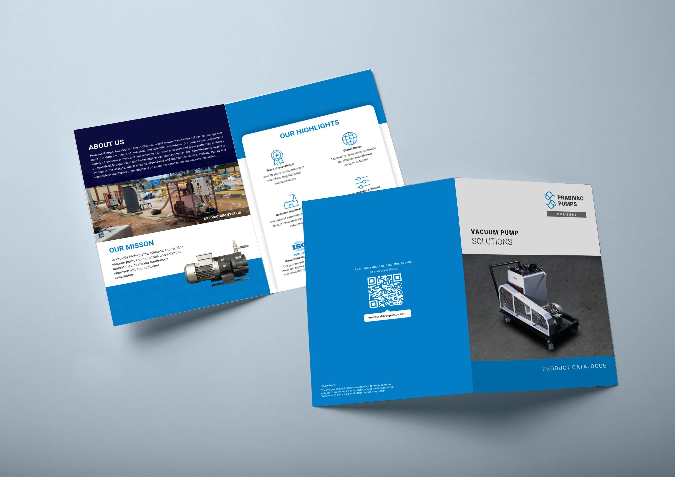
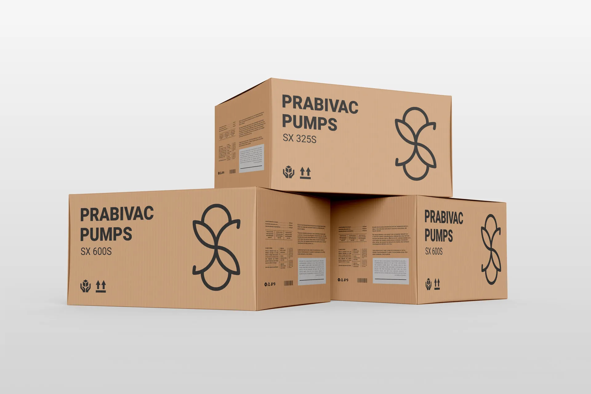
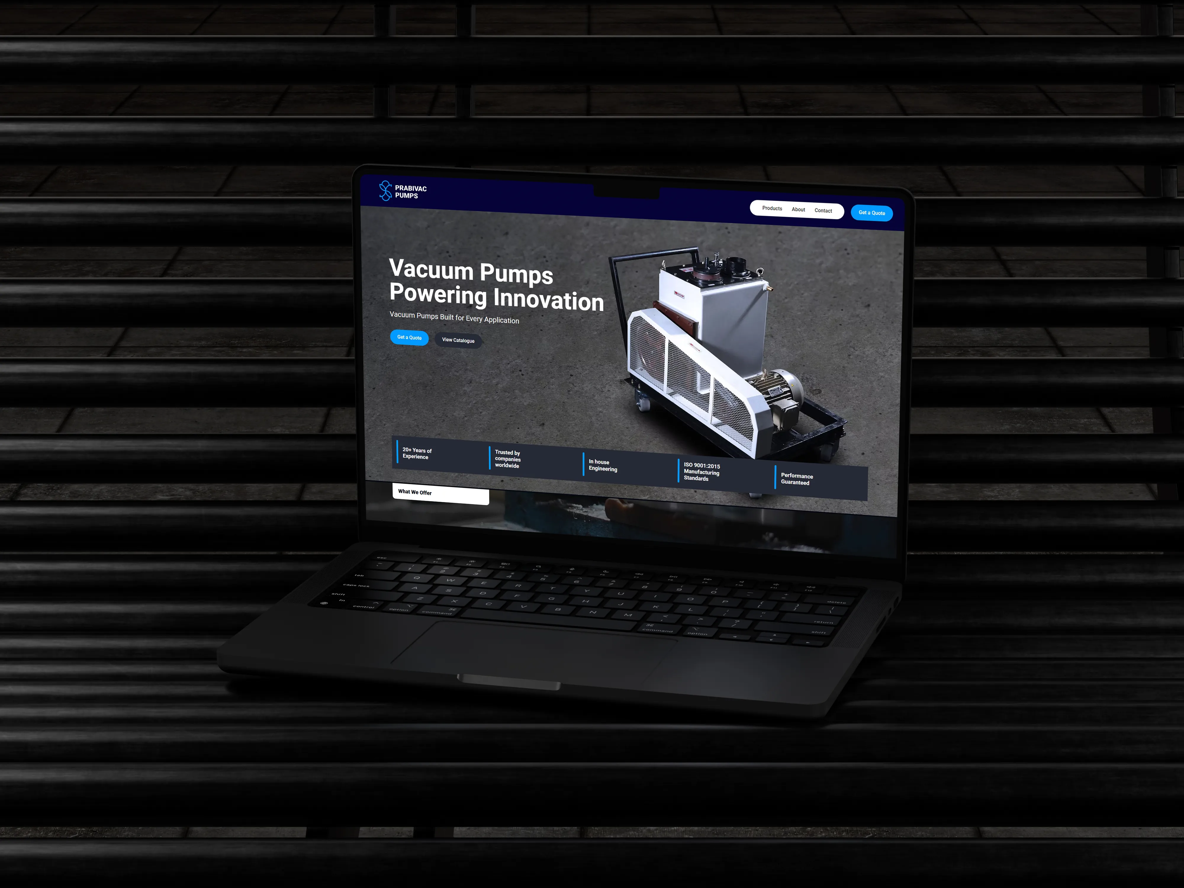
The identity system is designed to work effectively across multiple industrial touchpoints, including machinery branding, product documentation, and digital platforms.
The simplified geometry ensures clarity at both large and small scales, making the symbol highly versatile for real-world applications.
Want work like this? See our Branding service, or tell us what you need.
Start a project

.3f1-_mga-e_we.svg "Instagram")